
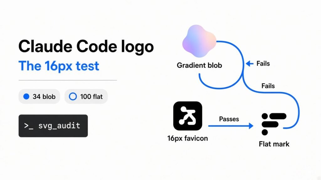
You asked a coding agent (a program that edits your files) for an app icon, and the Claude Code logo looks generic: a purple-to-cyan circle, a soft glow, and the product name set in a font. It looks finished in the chat. It falls apart in the browser tab.
This is for a developer shipping a product, not for a brand studio. You need a mark that still reads when it is tiny, in one ink, on a computer that does not have your font.
Claude Code is that agent in the terminal. A skill (a folder of instructions the agent reads before it draws) can turn the job into a logo job. The file you want is an SVG (a drawing made of shapes, not a photo).
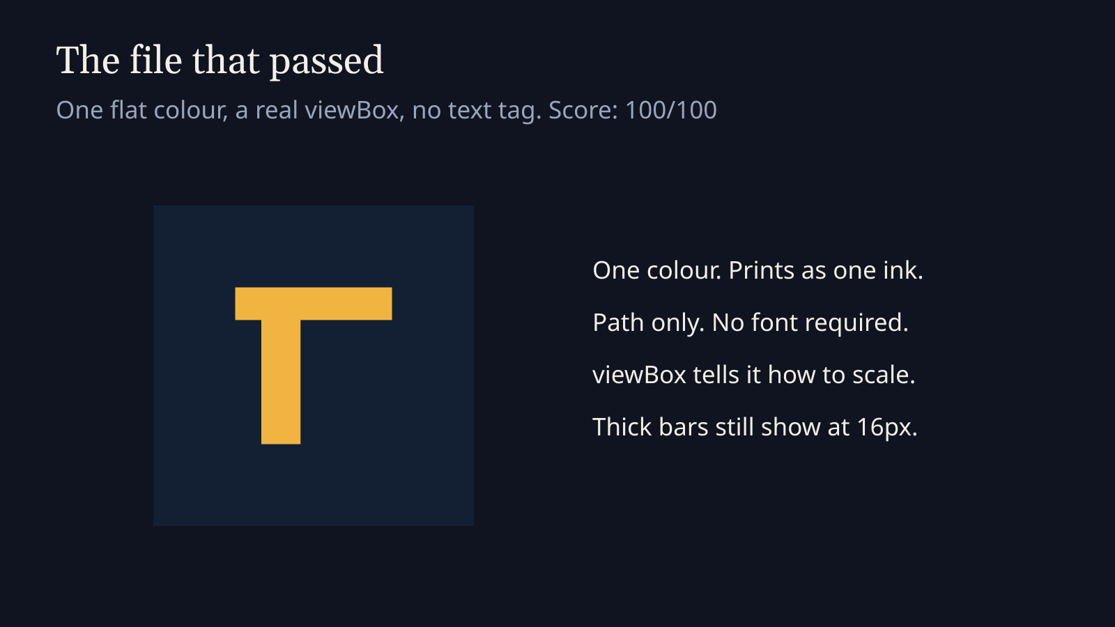
A Claude Code logo looks generic when it is a gradient blob with live text. A flat one-colour mark with a real viewBox passes a small-size audit. I wrote both files and ran the same checker. The blob scored 34 out of 100. The flat mark scored 100.
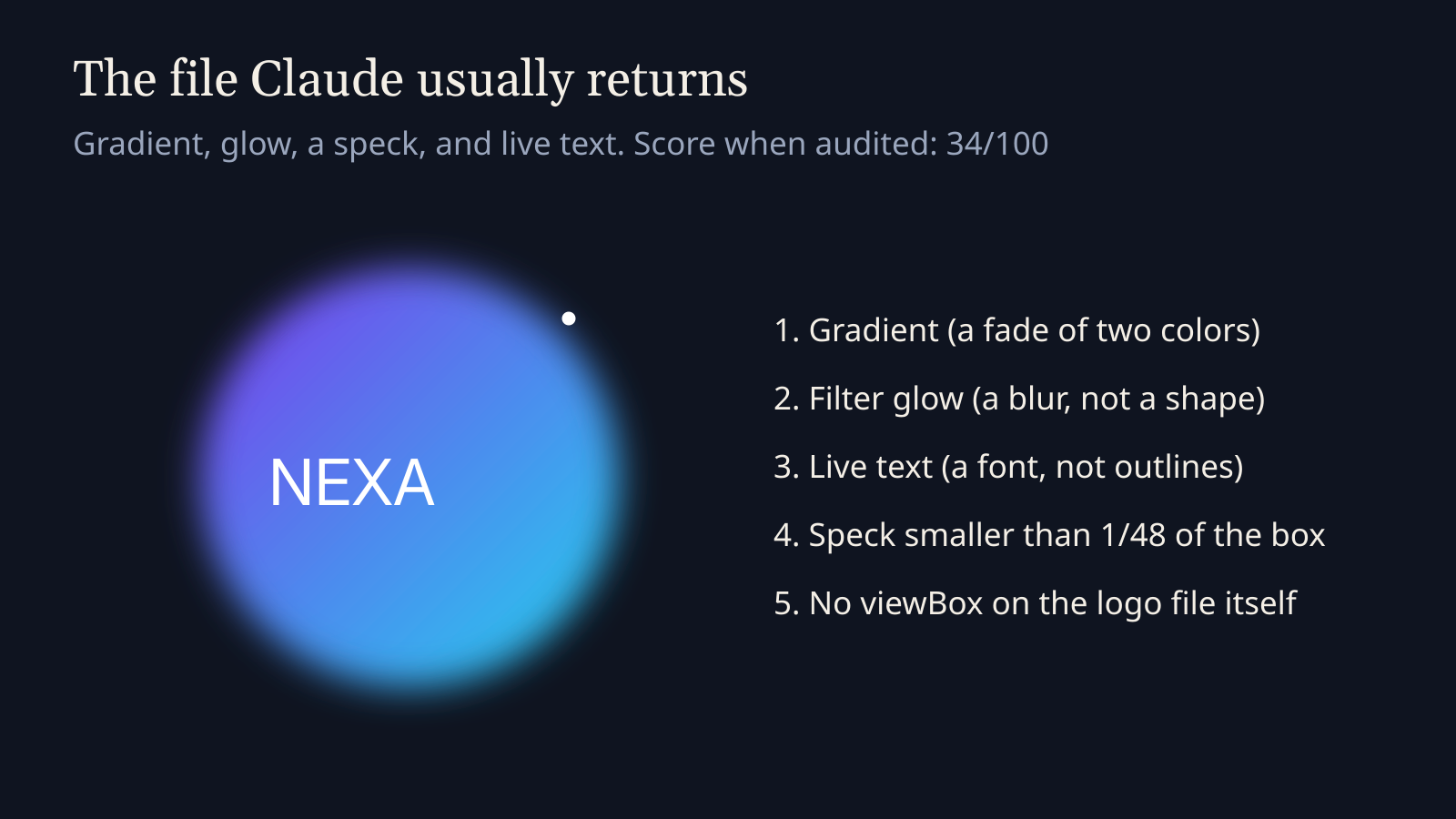
The left side of that picture is the failure mode. A gradient (a fade between two colors) plus a glow looks designed at poster size. Shrink it and the glow becomes mud.
Why does my Claude Code logo look generic?
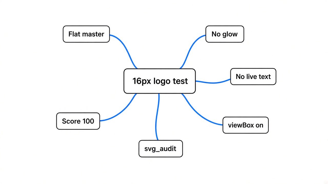
It looks generic because the file is a poster, not a mark. The model copies the average AI-startup icon: a circle, two bright colors, a blur, and the name in a thin font.
That average fails the job of a logo. A logo is an identifier (a mark that tells people which product this is). It is not an explanation of the product. If the picture needs the word AI or a glow to make sense, it is not identified yet. It is decorated.
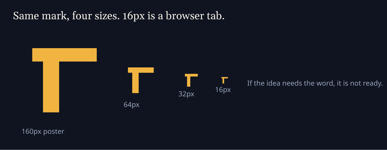
A favicon (the tiny icon in the browser tab) is about 16 pixels on a side. Anything thinner than a bar, or smaller than a speck, turns into gray noise there. Judge the idea at that size first. If you only judge the big preview, you will ship the blob.
How to test a Claude Code logo at 16px
Run one checker on the SVG. You do not need Claude for this step, and you do not need a design app. The checker is a Python script that ships inside the logo skill folder, next to a helper file it imports.
Clone the project and point the script at your file:
git clone https://github.com/kaankiziltug/logo-design-skill.git
cd logo-design-skill
python3 skills/logo-design/scripts/svg_audit.py /path/to/logo.svgI saved two fixtures and ran them together. Copy them if you want the same before and after.
The blob, saved as bad-logo.svg:
<svg xmlns="http://www.w3.org/2000/svg" width="512" height="512">
  <defs>
    <linearGradient id="g" x1="0" y1="0" x2="1" y2="1">
      <stop offset="0" stop-color="#7C3AED"/>
      <stop offset="1" stop-color="#22D3EE"/>
    </linearGradient>
    <filter id="glow"><feGaussianBlur stdDeviation="6"/></filter>
  </defs>
  <circle cx="256" cy="256" r="180" fill="url(#g)" filter="url(#glow)"/>
  <circle cx="400" cy="120" r="2" fill="#fff"/>
  <text x="80" y="270" font-size="64" fill="#fff" font-family="Inter">NEXA</text>
</svg>The flat mark, saved as good-logo.svg:
<svg xmlns="http://www.w3.org/2000/svg" viewBox="0 0 64 64">
  <title>North mark</title>
  <path fill="#0F7C80" d="M12 12h40v8H28v32h-8V20H12z"/>
</svg>Then:
python3 skills/logo-design/scripts/svg_audit.py bad-logo.svg good-logo.svgRead the score at the bottom of each file. Fix every line marked FAIL. Treat WARN as a question you must answer out loud. The script says the findings are advice, not law. If you keep one, write the reason next to the file.
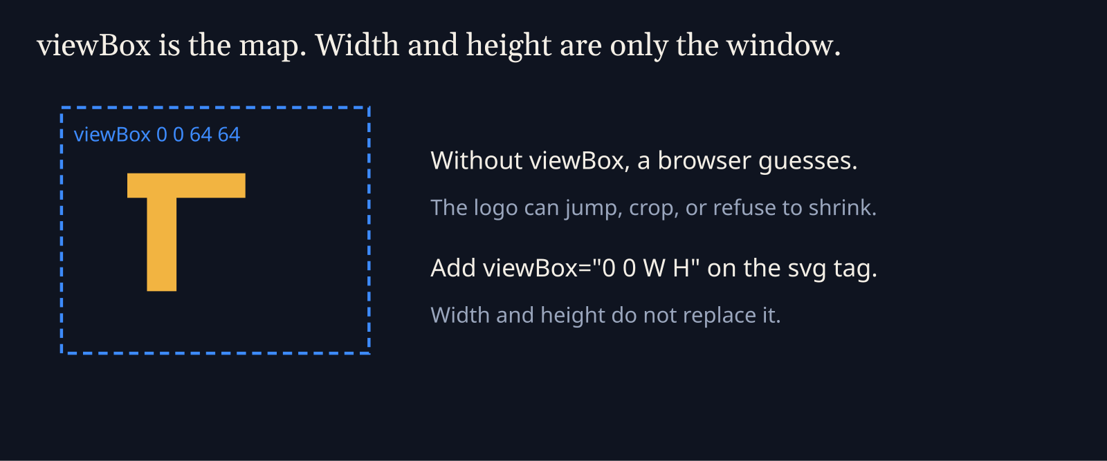
A viewBox (the map that says how the drawing scales) belongs on the svg tag, like viewBox="0 0 64 64". Width and height only set the window on the page. My blob had width and height and no viewBox. The script still printed a guessed box of 0 0 512 512, and it still warned no-viewbox. Guessing is not the same as declaring.
What the audit changed on the two files
The blob did not get a free pass for looking smooth. The flat mark did not get a free pass for being simple. The script counted structure, colour, and details that vanish when small.
| Check | Gradient blob | Flat mark |
|---|---|---|
| viewBox on the tag | Missing. WARN | Present. Clean |
| Live text | FAIL. The word NEXA is a text tag | None |
| Glow filter | WARN. A blur, not a shape | None |
| Gradient | WARN. One fade | None. One flat fill |
| White speck | WARN. 4 by 4 units near x 398, y 118 | None |
| Title for access | INFO. Missing | Present |
| Score | 34/100 | 100/100 |
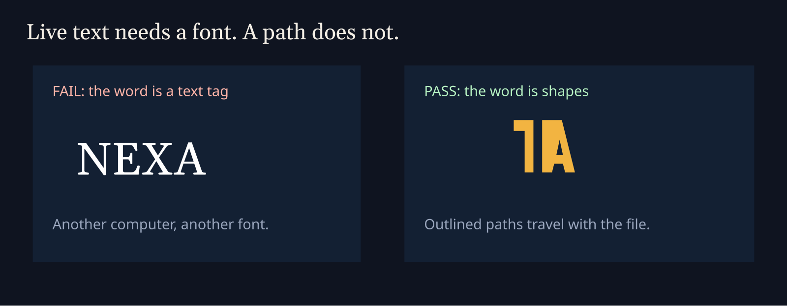
Live text (letters stored as a font name, not as shapes) is the hard fail. The file says draw NEXA in Inter. A laptop without that font draws something else. A cutter, a favicon exporter, and a one-colour print all get stuck. Outlined paths (letters converted into shapes) travel inside the file. The flat mark skips the word. The shape is the name.
The white speck fired two warnings at once. It is smaller than 1/48 of the canvas, so it vanishes around 48 pixels and is gone at 16. It is also painted white on top of colour. On a photo or a coloured background that white is a blob, not a hole. A real hole is a cut in the path, not a white sticker.
The score is a heuristic (a rough rule-of-thumb number, not a design prize). 34 means do not ship this file. 100 means the file will survive scale, one ink, and another computer. It does not mean the idea is clever. You still have to look at it.
Claude Code logo looks generic when the mark is not flat
Keep a flat master (one solid colour, no blur, no fade) even if you later add a colour version for the website. The flat file is the one that prints and sits in the tab. The pretty version is a costume on top.
Use the flat file when:
- The icon has to work in one ink.
- The same mark has to sit at 16 pixels and on a slide.
- Someone else will open the SVG on another computer.
Use a richer picture only after that master exists. Build the costume from the master. Do not start from the costume and hope it shrinks.
How to make a logo with Claude Code
Install the skill so the agent stops improvising a poster. In Claude Code:
/plugin marketplace add kaankiziltug/logo-design-skill
/plugin install logo-design@logo-design-skillIf that marketplace command is not available in your build, copy the folder by hand:
git clone https://github.com/kaankiziltug/logo-design-skill.git
mkdir -p ~/.claude/skills
cp -r logo-design-skill/skills/logo-design ~/.claude/skills/logo-designOpen a new session in the product repo so the agent can see the name and the existing colours. Paste this:
Ask for three concepts, not one. A single concept is usually the average circle. Three forces a choice: a letterform (the initial as the mark), a simple object, or an abstract shape. Pick the one that still reads when you cover the name with your thumb.
The skill also ships a search over a reference library of real marks, grouped by type and industry. Use it to see the usual shape of a category. Then draw away from the nearest neighbour. A library is a map of cliches, not a sticker book.
If the agent fixes the audit by deleting the warning in a comment, reject the file. The path has to change. The CLAUDE.md briefing is where you pin that rule so the next session does not forget it. Skills you never call still sit on disk and confuse later sessions. Prune those the way this skill cleanup shows.
When not to use a logo skill
Do not open a brand project when you already like the mark and only need a favicon set. The same folder has an export script for sizes. Redesigning here wastes the only part that was working.
Do not use this for a photo, a 3D render, or a detailed mascot. The checker wants flat vectors. A raster image inside the SVG is a fail (raster-image). So is HTML stuffed inside the SVG (foreignObject).
Do not ignore a warning you cannot explain, and do not obey a warning that fights a real choice. White paint on a coloured app tile can be on purpose. The script even says to ignore the white-knockout warning in that case. Write the reason in the file comment so the next person does not fix it.
Do not expect the skill to pick your strategy. It will not decide whether you are a bank or a game. You decide the idea. It stops the file from being a generic poster.
A logo skill is also the wrong fix when the agent is editing the wrong files or running commands you did not want. That is a permissions problem. The sandbox writeup covers what the agent is allowed to touch. How the loop reads a repo in the first place is the step-by-step teardown. If you are still choosing the agent, not the logo step, start with Step Code versus Claude Code.
Try this on your own file
Ten minutes, no design tool:
- Save the blob SVG and the flat SVG from above.
- Clone the repo and run
svg_audit.pyon both. - Confirm you see 34 on the blob and 100 on the flat mark.
- Replace the blob text with nothing, delete the filter and the gradient, add
viewBox="0 0 512 512", and delete the 2-unit circle. - Run the script again. The score should jump. If a WARN remains, read that one line and fix only that.
That second run is the whole lesson. You are not collecting tips. You are watching one file become shippable.
How do I stop Claude from making a gradient blob logo?
Tell it the file rules before it draws, then reject any file the audit fails. Make it more unique is how you get a second blob.
Put the rules in the prompt above, and pin them in the project briefing so a new session cannot shrug them off. Unique is a side effect of a simple shape. It is not a style word you can ask for.
Can I test an SVG logo at 16px without a design tool?
Yes. Run svg_audit.py on the file. It flags details smaller than 1/48 of the canvas, which is about one pixel at 48 pixels and noise at 16.
Open the SVG in a browser and zoom the window down until the mark is the size of a tab icon. If you cannot tell what it is, the audit was right. You do not need a design app for that check.
Is a Claude Code logo skill worth it?
Yes, if Claude keeps returning poster icons and you are willing to run the audit after each concept. No, if you already have a mark you like.
The skill does not invent taste. It adds a process: a brief, three concepts, a flat SVG, and a checker. Without the checker, the process is just a longer prompt. The checker is the part that changed my two files from a vibe to a score.
My AI logo fails when I shrink it. What should I change?
Delete the small parts first. Then remove the glow, the gradient, and any live text. Then make sure viewBox is on the tag.
Rebuild the idea with two or three thick shapes. If the name is required, outline the letters into paths and keep a separate icon that works with the name covered. A wordmark (the name as the logo) can be the large version. The tab still needs a mark.