
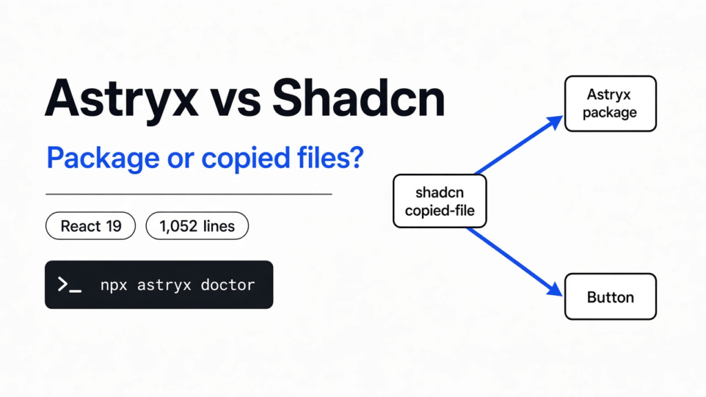

I already had a Save button written the usual way, the word sitting between the tags. Then the question was astryx vs shadcn, and it was not about which blue is nicer. Astryx is a React library you install. shadcn is a set of files a command copies into your project so you own them. I installed Astryx in an empty folder, rendered one button, and copied the button source out. The copy was 1,052 lines, and the tool warned the page would not render until I added a style compiler. Stay on shadcn if you want a short file you can edit tonight. Use Astryx if you are happy to import the button and leave that file in the package.
That contrast is about who owns the component file. It is not the paper-sketch look in Looseleaf vs Shadcn, which keeps shadcn props on a real button and only changes the paint.
What is Astryx
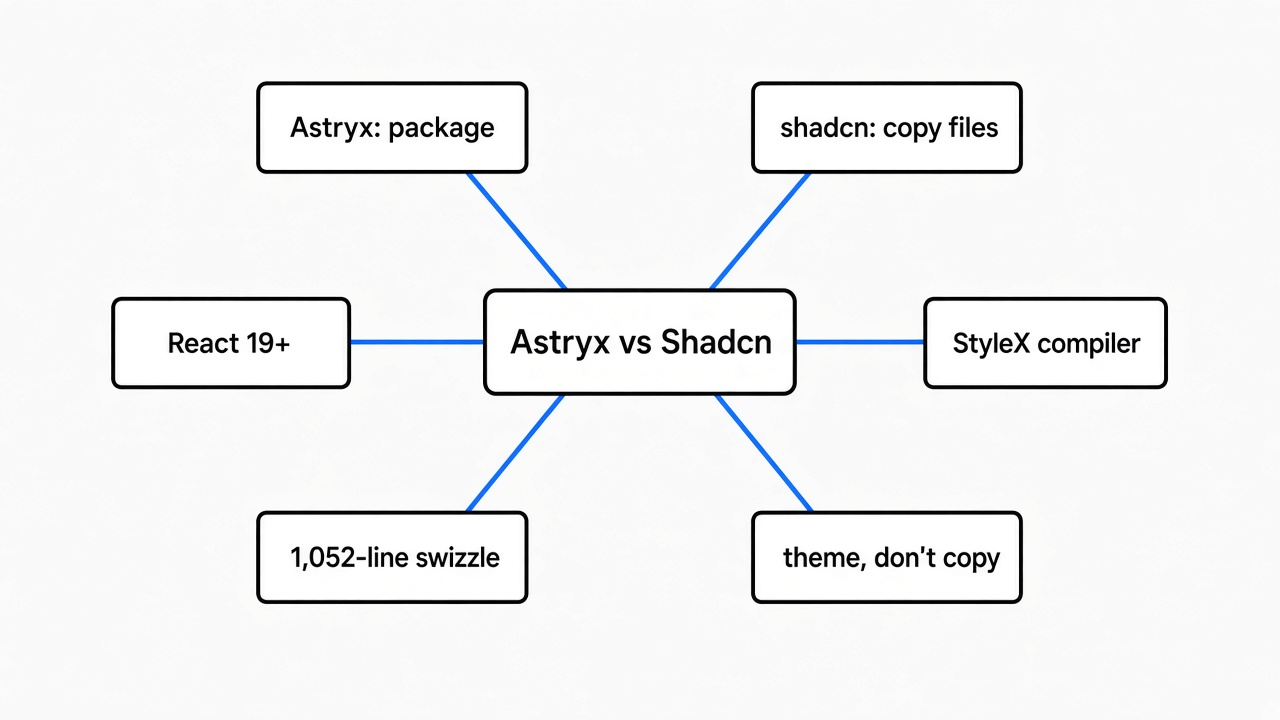
Astryx is a React component library. You install a package, import a button, and the look comes from a CSS file that package already built.
A design system here means the shared buttons, dialogs, and spacing, so two pages do not invent two different Saves. shadcn is the other habit. A command copies the button’s source into your project, and from then on that file is yours. You can change it in the same pull request as the page. You also keep it when the upstream button changes, unless you go copy a newer one on purpose.
I asked the Astryx command line for the component list. It printed 174 names, each with its own import path, such as @astryxdesign/core/Button. The main package file also exports Button, so a short import works too. The path the tool printed is the one I used.
Astryx vs Shadcn
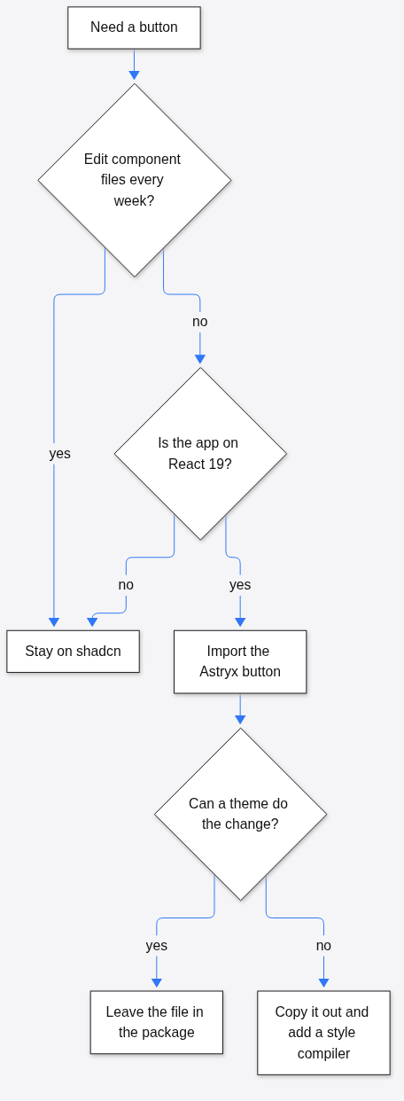
Use Astryx when you want the button to stay in the package and arrive again when you upgrade. Stay on shadcn when you want a small file in your repo that you can change with no extra compiler.
I expected Astryx to reject the shadcn shape, a button whose only text is a child and that has no label prop. It did not. A server render of that button still printed the word Save. When I passed both a label and a child, the visible word was the child, and the label moved onto aria-label. The old habit still paints. The command’s own notes still want label, because that is the accessible name when there is no visible text. An icon-only button showed that split: the visible mark was x, and the accessible name was Close.
| Astryx | shadcn | |
|---|---|---|
| Button text | label prop, and children still render | children inside the tag |
| Where the code lives | in the package, until you copy it out | in your repo from the start |
| React | 19 or newer, as a declared peer | the usual shadcn setup also runs on older React |
| Look | one prebuilt CSS file, 269,224 bytes | Tailwind classes in the copied file |
| Change one button | five files, 1,052 lines in the button, plus a compiler | edit the file you already have |
Checked against Astryx 0.7.11 and the shadcn docs, Nov 2026.
How do I install Astryx
Install the core package, one theme, and the style runtime, then add the command line tool as a dev dependency. The peers on the package I installed were React 19 or newer and @stylexjs/stylex at 0.19.
npm install @astryxdesign/core @astryxdesign/theme-neutral @stylexjs/stylex
npm install -D @astryxdesign/cliCore, theme, and the command line tool all resolved to 0.7.11. The doctor command then said Node was new enough and the two Astryx packages matched. It also warned that the theme package was on disk and still not wired into the app. The fix it printed was to add the theme with the theme command, not to reinstall.
The smallest button that rendered:
import { Button } from '@astryxdesign/core/Button';

<Button label="Save changes" variant="primary" />I rendered that on the server, with no browser. The HTML was a real button, marked primary, size md, and the visible text was Save changes. It carried 78 classes. Adding className="mt-4 my-extra" raised that to 80, and both of my classes were still on the tag.
You still import the CSS once, from @astryxdesign/core/astryx.css, or the button has classes and no paint. That CSS file was not loaded in a browser here, so this is not a measured margin. The claim is that the class landed on the tag. The theme is the same kind of gap: installing @astryxdesign/theme-neutral did not turn the theme on. Doctor said so, in those words.
What happens if I swizzle an Astryx button
Swizzle means the command copies that component’s source into your project so you can edit it. On Button, the copy was five files and 1,524 lines, and the button file alone was 1,052.
I expected a short component, the kind of file shadcn drops in components/ui. What landed was the real implementation, plus a press-style file and a reduced-motion file. The note under the copy was specific. Those files call StyleX, which is a compiler that turns style rules into plain CSS before the page loads. Without that compiler, the import throws Unexpected 'stylex.create' call at runtime and the page does not render. The same note said the Next.js Babel plugin for StyleX turns off SWC and breaks next/font, so the SWC transform is the one to use if you go this way.
That is the turn. Swizzle sounds like the shadcn move. It is not. You only do it when the package button cannot say what you need, and you accept a compiler and a thousand-line file. For a color change, do not copy the button out. Add a theme.
The theme list printed seven names: butter, chocolate, gothic, matcha, neutral, stone, and y2k. Only neutral was marked maintained. The others ship with the tool, but the tool itself does not call them maintained. If I needed a brand color, I would start from neutral and change tokens, not from a theme the command already flagged.
A theme is a set of named colors and sizes. Astryx applies that idea with a theme package and CSS variables.
Does Astryx work with Tailwind
The class I added stayed on the element, and the shipped CSS sits in a layer named astryx-base, which is how a later Tailwind rule is supposed to win.
A layer is a named group of CSS, with an order. The file opens by declaring that order: reset, then astryx-base, then astryx-theme. Rules inside a layer lose to rules that are not in a layer, and they lose to a layer that comes later. That is why the package can ship strong styles and still let your className matter. I confirmed the class string. A browser was not opened for this check, so the margin was not watched as it painted.
There is a second file, tailwind-theme.css, about 12 KB, if you want those tokens as Tailwind theme values. The main stylesheet was 269,224 bytes. Budget that on the first load. It is one file for the whole kit, not a file per button.
One caveat from the button notes the command printed: do not restyle the button’s ::before through a class and expect it to hold during a press. The press paints on that pseudo-element while the pointer is down. Style a child instead, and the press can keep its own layer.
Should I switch from Shadcn to Astryx
Switch if the app is already on React 19, you want one library to upgrade, and a coding tool needs a command that prints the current props. Stay if the app is on an older React, or if your team edits component source every week.
I would not migrate a finished shadcn app for the look. The buttons can be made to match either way. I would start a new internal tool on Astryx when a coding tool keeps inventing props that do not exist, because npx astryx component Button printed the real table, including label, variant, isLoading, and clickAction. shadcn’s answer to a wrong prop is to open the file. That is also fine, and it is faster when the file is short.
Skip Astryx if you cannot live with a 0.x package. The build I installed is 0.7.11, so a minor bump can still change a call. shadcn’s breaks show up as a diff in your repo, which is noisy and visible. Astryx’s breaks show up when you upgrade the package, which is quiet until the build fails. Pick the kind of noise you will actually notice.
The install I used was the core package plus the neutral theme. Charts were not in that install. If the page is mostly charts, check that separate package before you commit the app to this kit.
Common questions about Astryx vs Shadcn
Can I use Astryx on React 18
No, not on the package I installed. It declares a peer of React 19 or newer, and of react-dom at the same floor. An older React was not forced onto it here, so this is not a claim about the error text. If the app is still on React 18, stay on shadcn, or upgrade React first and then render one button before you move the rest.
How do I try this in ten minutes
Make an empty folder, install the three runtime packages, and run doctor plus one component read. Do not copy a component out until you have seen the file size.
npm install @astryxdesign/core @astryxdesign/theme-neutral @stylexjs/stylexnpm install -D @astryxdesign/clinpx astryx doctornpx astryx component Button --detail compactnpx astryx swizzle Buttononly if you want to see the line count before you promise a custom button
If doctor says the theme is not wired, run npx astryx theme add neutral before you judge the colors. If the copy step mentions StyleX, stop. You do not need that path to use the button. You need it only when the packaged button cannot say the thing.
The same split shows up in nearby jobs. A design skill changes what a coding tool writes. It does not replace the library. That difference is in how do I make Claude Code websites not look generated. If the picture is a diagram and not a control, that is a different fork than a component kit. The cost of leaving a design plugin on all the time is in which Claude Code plugins are worth installing.
The repo is meta/astryx. The shadcn docs are at ui.shadcn.com.
I am leaving the button in the package. The moment I need a button the theme cannot make, I will look at those 1,052 lines before I call it a small edit. If that file looks like a project of its own, that screen stays on shadcn.